Useful website animation without the AI slop
The practical answer
Useful website animation explains a change, directs attention, or expresses a specific brand idea. Give every sequence a defined purpose, trigger, and ending. Keep the message and controls usable when the animation is paused, unavailable, or disabled.
Based on the Click and Mortar site's own motion work: viewport-triggered scenes, optional playback, static fallbacks, and separate code for interactive controls. These are design and engineering lessons, not a measured claim of higher conversions.
Give the animation a job in one sentence
A website can contain expensive animation and still feel generic. The problem is often that the movement has no relationship to the visitor's decision. Floating objects, endless camera moves, and repeated reveals compete for attention without making the offer clearer.
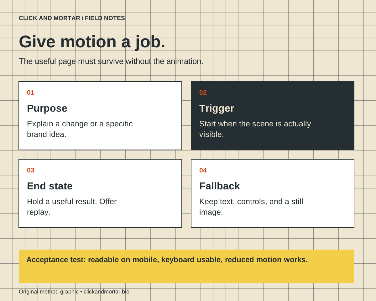
Before opening a generation tool or an animation library, finish this sentence: this motion helps the visitor understand ___. A diagram can show how a service connects to the next stage. A button transition can confirm a selection. A character can carry a brand idea through a short sequence. If the sentence only says it looks impressive, simplify the sequence or remove it.
For our construction-themed website, building, inspecting, and handing off a digital property supply a visual vocabulary. That makes a construction action relevant to the brand. Repeating the same action beside unrelated content would weaken that connection.
Write a motion brief before writing a prompt
Treat the sequence like a small product requirement. Specify the visible starting state, the action, the result, and the exact moment it should begin. Decide what stays readable throughout. A useful brief is specific enough that someone can reject a technically attractive result for doing the wrong thing.
For a service explanation, the brief might be: a worker places one labeled panel into a frame after the section enters view; the section title and call to action stay still; the finished frame remains visible. This gives the movement a beginning and an end, and leaves the visitor with the useful result.
| Decision | Example requirement |
|---|---|
| Purpose | Explain how one step contributes to the finished website. |
| Trigger | Begin when the section is genuinely visible. |
| End state | Hold a clear completed composition. |
| Controls | Provide replay or pause when appropriate. |
| Fallback | Show a still image without hiding the explanation. |
Separate generated footage from real interface behavior
Generated footage is useful for authored texture, character movement, or a short illustrative scene. Code is the dependable place for text, links, focus states, selected options, and layout. Keeping these responsibilities separate lets the site preserve a readable headline even when a clip needs to change.
Do not bake a service price, button label, or important instruction into the video alone. Real text can wrap for mobile screens, remain searchable, and respond to assistive technology. A video of a button cannot replace an actual button.
Choose the simplest medium that performs the job. A brief CSS transition may explain a selected state better than a rendered sequence. Use a generated clip when its visual performance adds something the interface cannot express economically.
Make playback follow attention
One lesson from our homepage work is that starting every clip when the page loads wastes the performance on sections nobody has reached. Start a scene when its own section becomes visible. For an illustrative sequence, playing once and offering Replay can leave a calmer reading experience than perpetual looping.
Do not hold the entire website behind an ornamental loader. If a clip or font does not arrive, the visitor still needs the page. Define a fallback that reveals the content, and test it by blocking the media request rather than assuming your connection represents everyone else's.
Long-running movement alongside text needs suitable control. Respect the device's reduced-motion preference and make the nonanimated version intentional. This is part of designing the experience, not an alternate mode to bolt on after the animation is approved.
- Keep calls to action reachable before media finishes.
- Avoid restarting a scene every time the visitor scrolls a few pixels.
- Use a visible pause control for persistent motion where required.
- Make reduced-motion content communicate the same essential message.
References: W3C: Pause, stop, hide; MDN: prefers-reduced-motion
Judge the page in use, not the exported clip
Inspect the website at a narrow phone width and a short laptop height. Watch what the animation covers, whether the text jumps, and whether the visitor can use the keyboard without chasing moving controls. Then repeat with reduced motion enabled and the media unavailable.
Reserve the space the media needs so late loading does not push the page around. Export at a size appropriate to its actual placement, use a poster, and avoid eagerly downloading every below-the-fold movie. Measure the published page under realistic conditions before calling it fast.
The acceptance question is whether the visitor can understand the service and take the next step more easily. If the motion makes either task harder, the fix is often less movement, a clearer end state, or a better position on the page. The number of animations is not a measure of design quality.
References: web.dev: Lazy loading video
Common questions
Does animation automatically improve conversions?
No. Motion may clarify a useful interaction or distract from it. Judge it against the page's purpose and test meaningful outcomes before claiming a conversion improvement.
Should every animation play only once?
No. Play-once behavior fits many explanatory sequences. Repeated or continuous motion needs a reason and appropriate controls; interactive feedback should follow the action it explains.
Sources and further reading
Primary references checked on September 9, 2026. Product claims belong to the cited provider; implementation recommendations reflect our judgment.
Field Notes / for developers
The next lesson, in your inbox.
A short, practical blurb for every new note, with a link to the full method. Web development, useful motion, automation, and lessons from AI-assisted builds. Up to three emails a week.
Developer notes, no sales sequence. Privacy · Prefer RSS?
AI assists research and drafting. Articles are checked for source support and clear distinctions between examples and verified work. Read our editorial policy. Suggest a correction.